


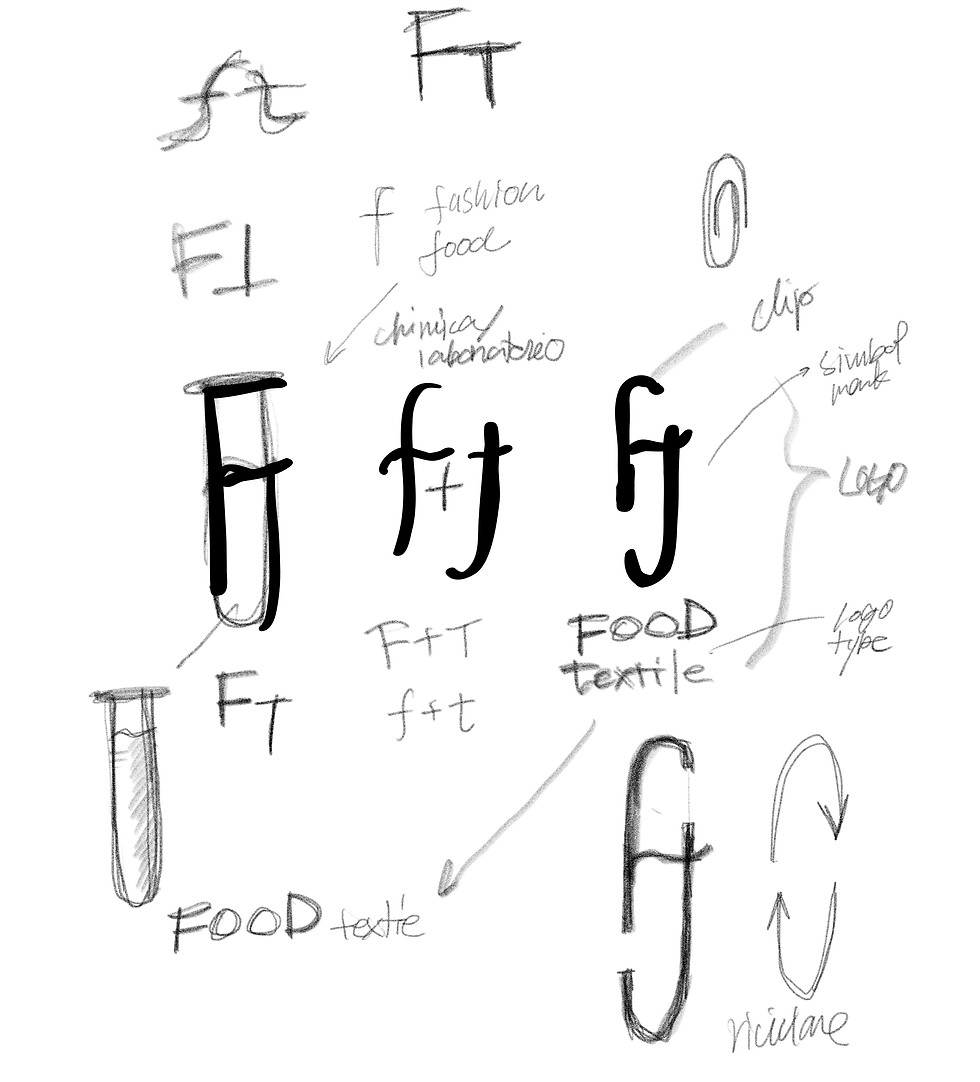
At the same time, the structure of the “f” and “t” subtly evokes the image of a circular sustainability mark, suggesting cycles and regeneration. It visually expresses the philosophy of materials and resources circulating and being reborn into new forms of value.
A sans-serif typeface was chosen for the logotype. Its clean and understated presence allows it to sit seamlessly alongside even luxury brand tags never overpowering, yet maintaining a confident and distinct identity.
Experimentation, circulation, and a commitment to the future this logo design captures the essence of the project in a simple yet powerful visual language.

graphic
graphic
Food Textile is a Japanese brand that transforms discarded food ingredients into dyes, creating a range of products rooted in sustainability and innovation.
Its logo combines the initials “f” and “t” from food, fashion, and textile, forming a design inspired by a test tube filled with dye. This motif symbolizes the experimental nature of the dyeing process, an ongoing exploration that crosses disciplines to generate new value. The form embodies the project’s spirit of continual challenge and discovery, distilled into a symbolic shape.
foodtextile
logo design
Akihabara, Tokyo, Japan
2022
